Proto Holograms
Unifying the user experience across a growing suite of products through design system contributions, feature development, and cross-functional collaboration.
Year:
2022-23
Industry:
Spacial Technology
Role:
Junior UX Designer
Duration:
6 weeks

The Challenge

At Proto I worked across a diverse range of products that formed their growing ecosystem. Their products included a web-based cloud system, a Live Beam (Stream) App, and a holographic display, each having unique user needs and interaction models.


A Simple Solution with One Limitation
The 3D Objects feature extended across the Proto ecosystem, bridging both web-based CMS and holographic devices (Epic and M). With the goal of enabling users to upload, manage, and interact with the content seamlessly across products.
The one issue, that was unknown to us, was that shipping this feature would launch as a dead end for the majority of users due to them using the legacy Windows OS on their Proto device.
The Research
Identifying an Existing User Experience
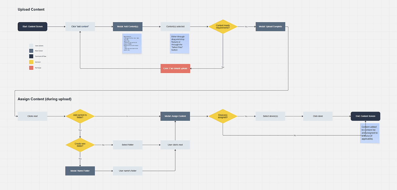
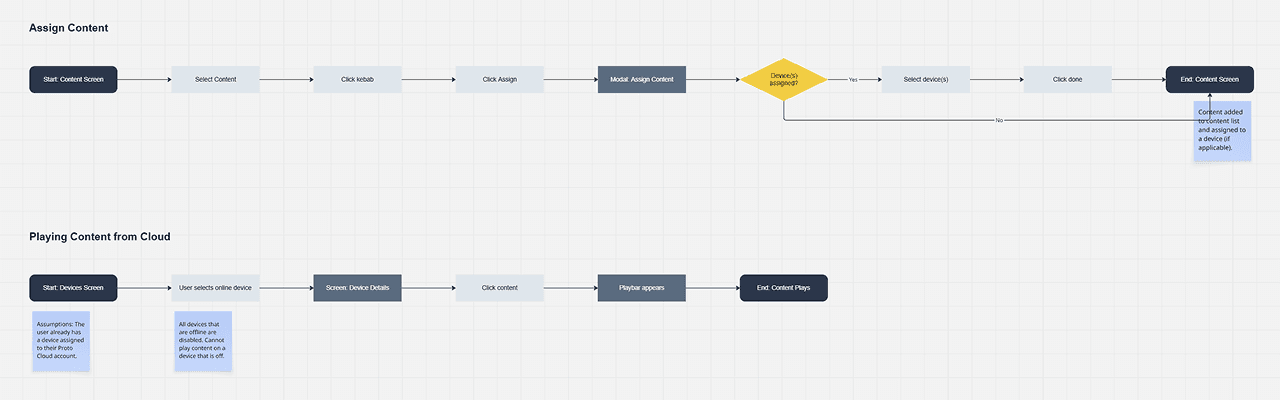
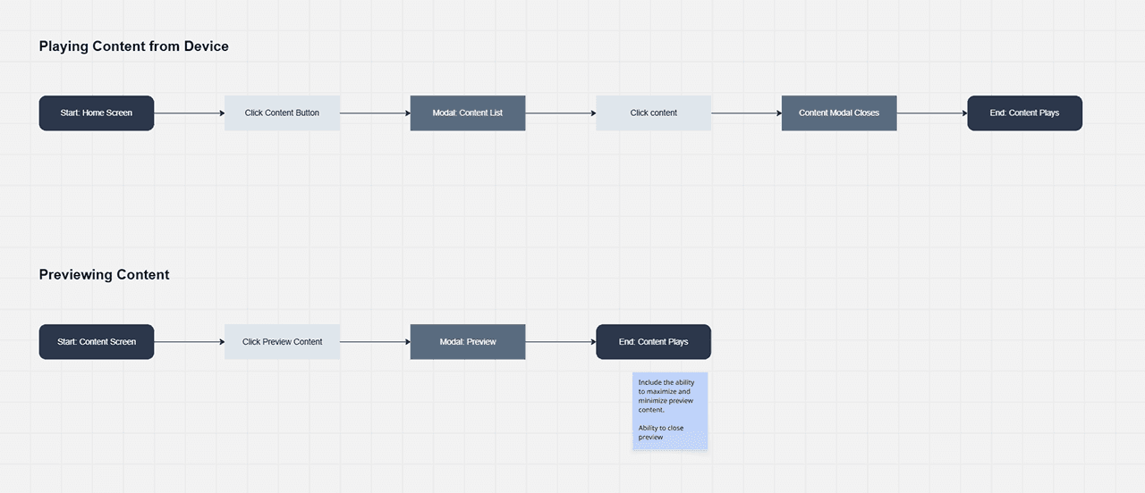
With the goal set, I began mapping use cases by identifying the actors, goals, and flows that would define the 3D Objects experience across each platform surface.
From this, I discovered that some use cases, such as the upload processes, mirrored existing functionality. By leveraging established user flows, I ensured that the experience felt familiar to users while addressing varying needs of managing and displaying 3D objects.


Understanding Indirect Competitors
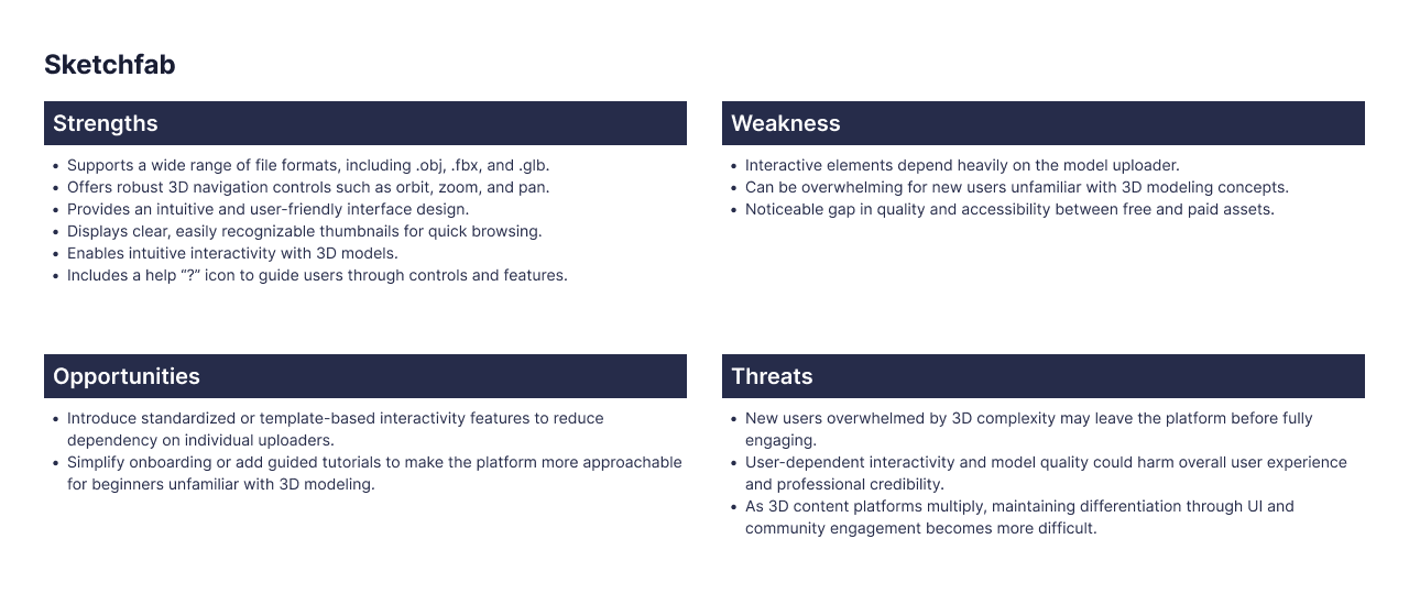
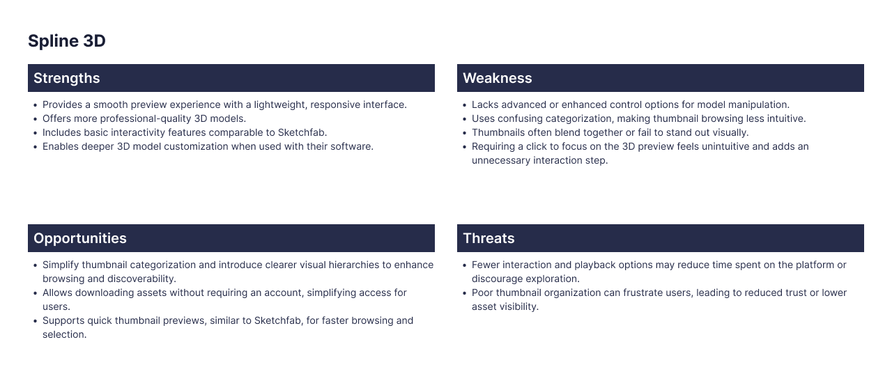
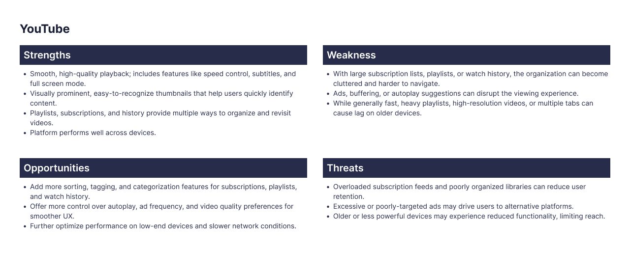
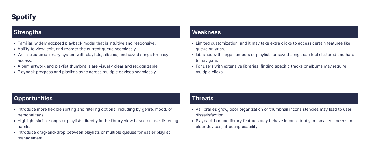
I analyzed four products across two distinct dimensions — chosen deliberately, not by default:
Sketchfab & Spline 3D — for 3D upload and preview UI patterns in a browser context
Spotify & YouTube — for playbar and media control conventions that users already have strong mental models around
Finding 1
3D preview tools universally default to orbit controls (rotate, zoom, reset) — but none addressed the specific constraint of a fixed-distance holographic display. We couldn't copy patterns directly; we had to adapt them for a fundamentally different viewing context.
Finding 1
The remove icon was visible but non-functional. Users tapped it repeatedly with no response — no tooltip, no error, no guidance.
Finding 2
Users approaching 3D content upload consistently attempted to assign content to a device before uploading it — revealing a workflow assumption we'd gotten wrong. Upload had to come first in the information architecture.
Finding 2
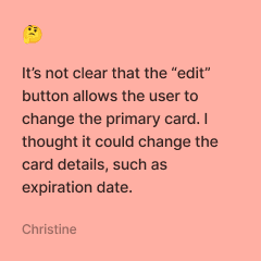
Users had no way of knowing they could set a different card as primary. The testing indicated that users relied on independently reasoning this out.
Finding 3
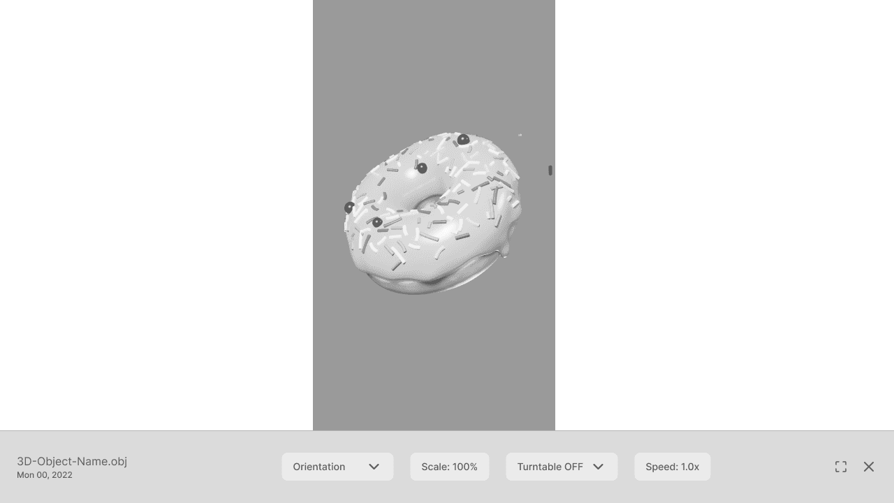
Playbar conventions from video (Spotify/YouTube) translated well as anchors — users expected controls at the bottom of the screen. This gave us a familiar scaffold for an unfamiliar interaction.
Finding 3
Playbar conventions from video (Spotify/YouTube) translated well as anchors — users expected controls at the bottom of the screen. This gave us a familiar scaffold for an unfamiliar interaction.
The Process
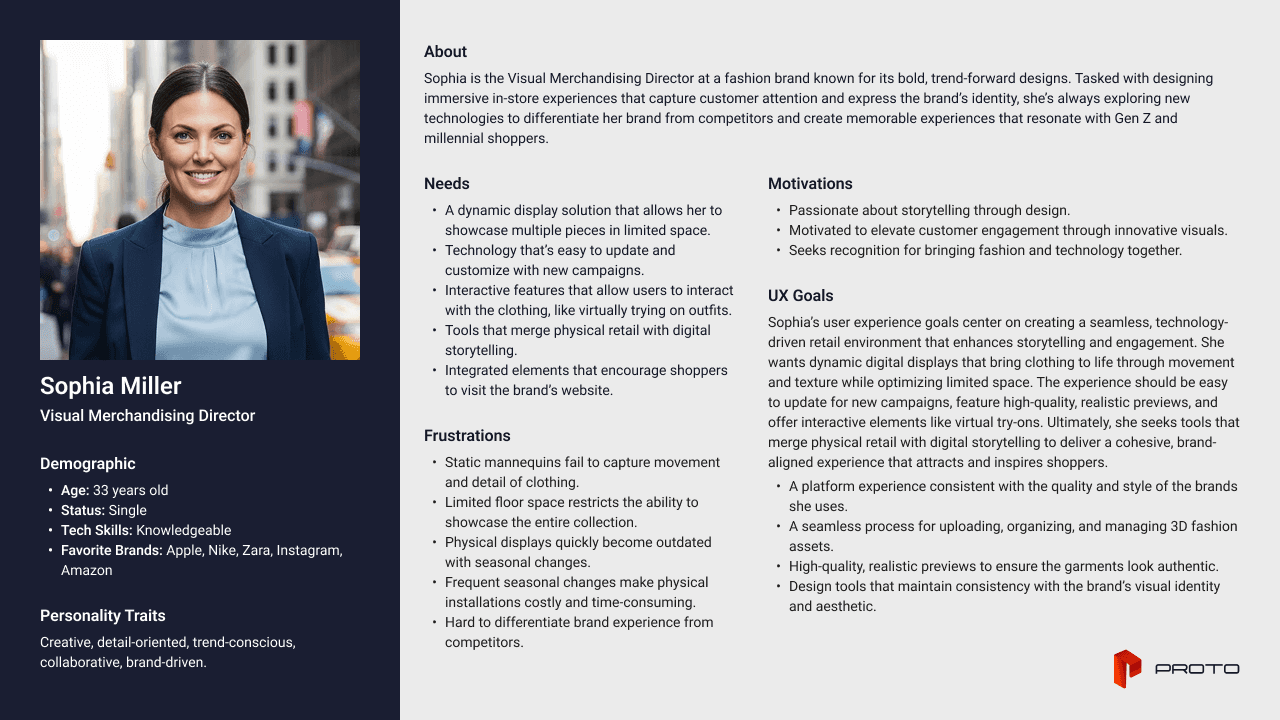
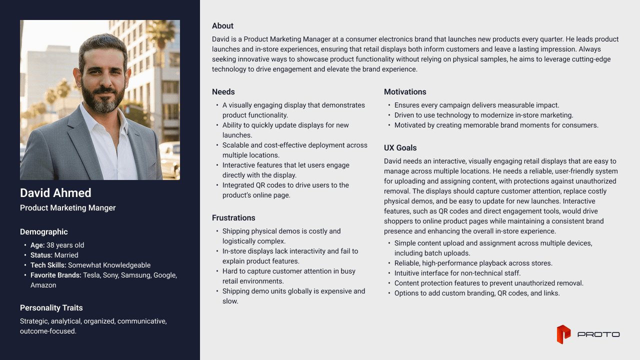
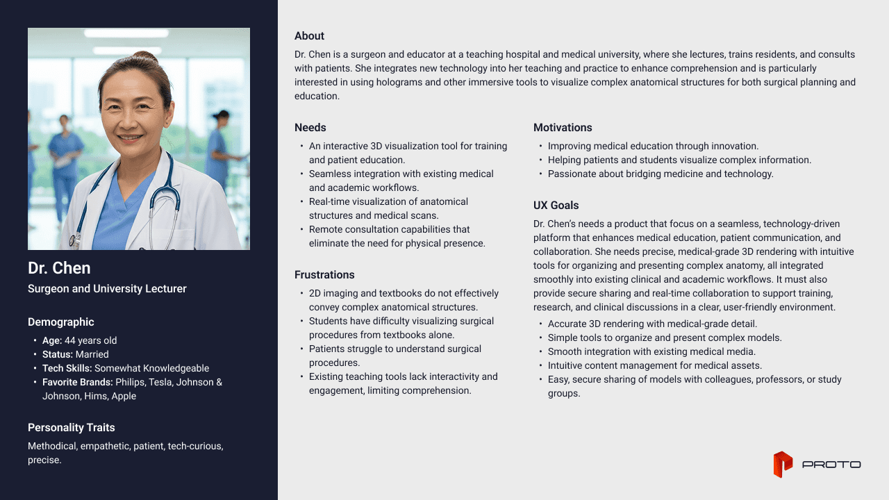
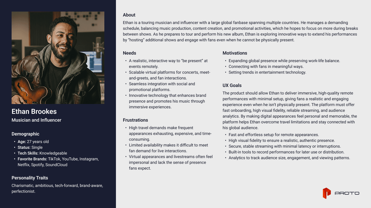
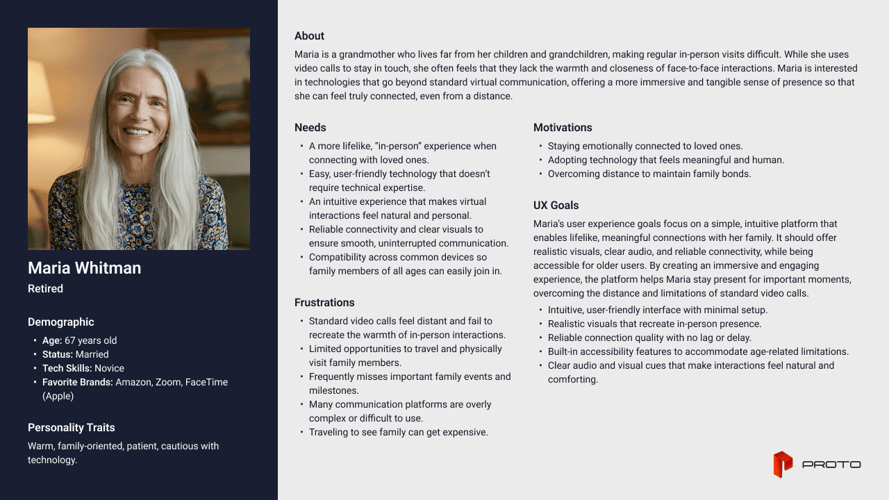
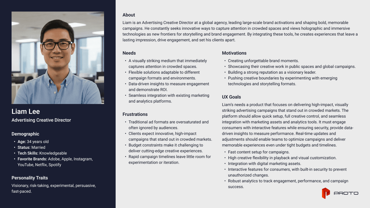
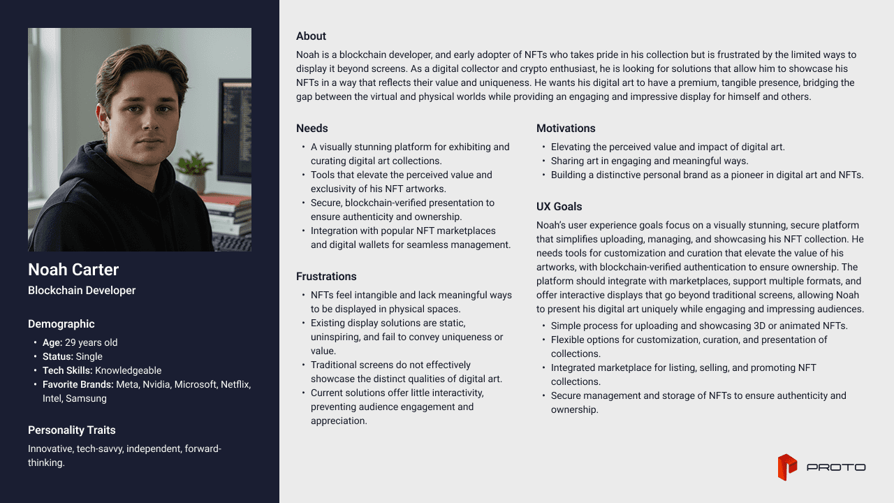
As Proto is a startup, it was challenging to pinpoint exact users since limited research was available to define them. Despite this constraint, I created quick personas informed by Proto’s existing consumer base, which helped ground design decisions in realistic user needs and behaviors.
From Insight to Decisions
I explored structural approaches early, hit a hard OS constraint mid-project, then scoped deliberately across two phases to ship a validated foundation before extending the experience.
Early Exploration
The Roadblock
Phase 1: MVP -> Phase 2: Controls
Early Exploration
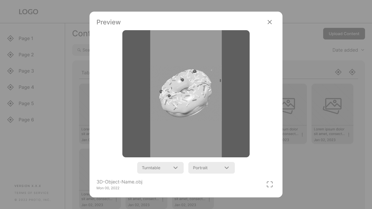
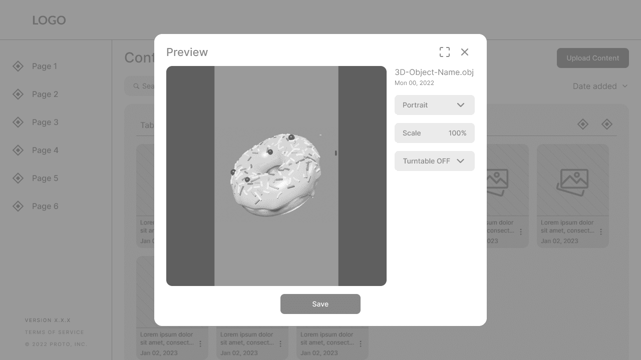
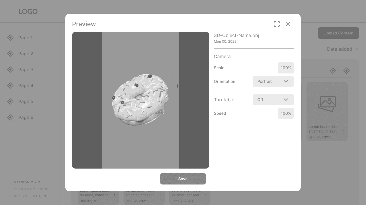
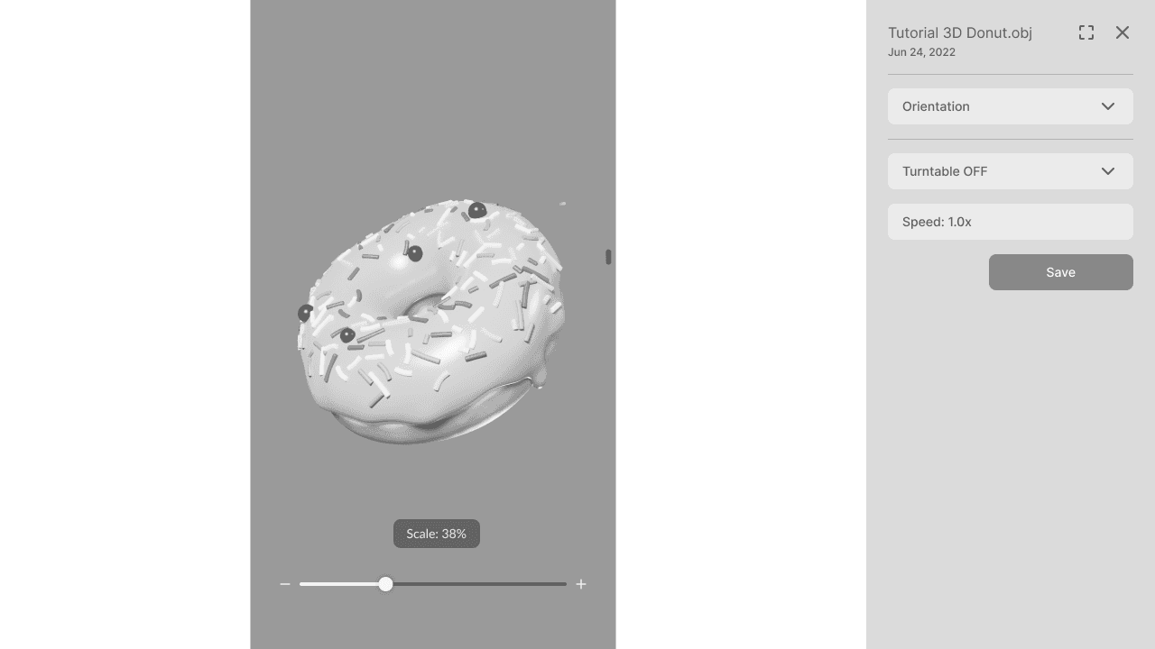
Two structural approaches tested for the 3D preview experience. Option A (full-screen modal) isolated the preview but removed all context — users felt ‘lost’ navigating back. Option B (inline panel) rendered the preview alongside the content list with no context switch. Internal testing confirmed users expected to stay in place. Inline panel chosen.








The Solution
Decisions that Defined the Shipped Solution
The goal for phase 1 was to introduced this feature for the many users that requested it. Since user were already familiar with our upload, assign, and playback workflow. It was a priority to reuse this experience for the MVP to rollout this new feature.

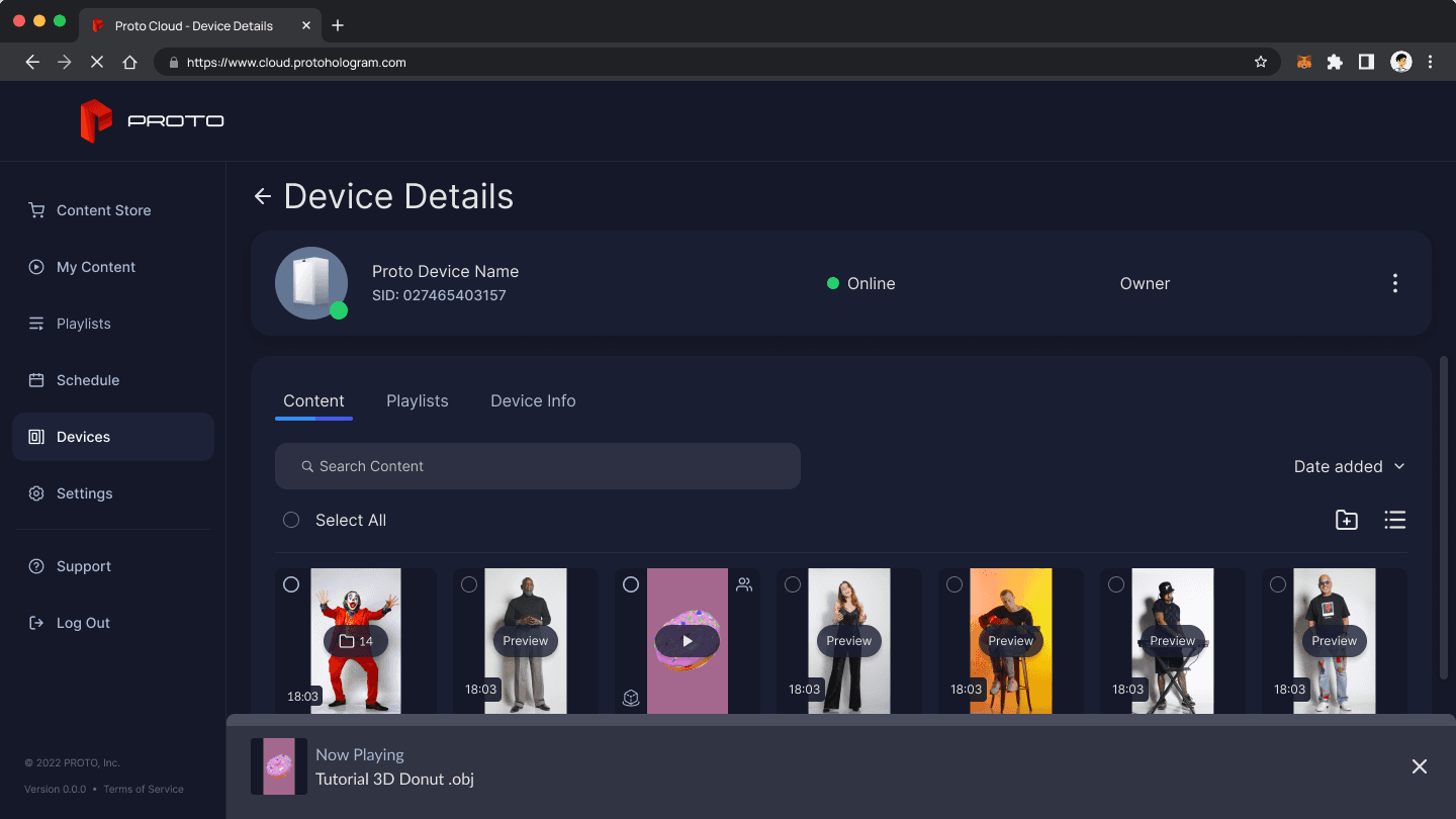


At launch, Proto received customer support calls to help user update their system to the new ProtoOS. This minor roadblock mid-project allowed for the opportunity to update their device to try out the feature. A happy little accident, if you will.
Post-Launch Decisions
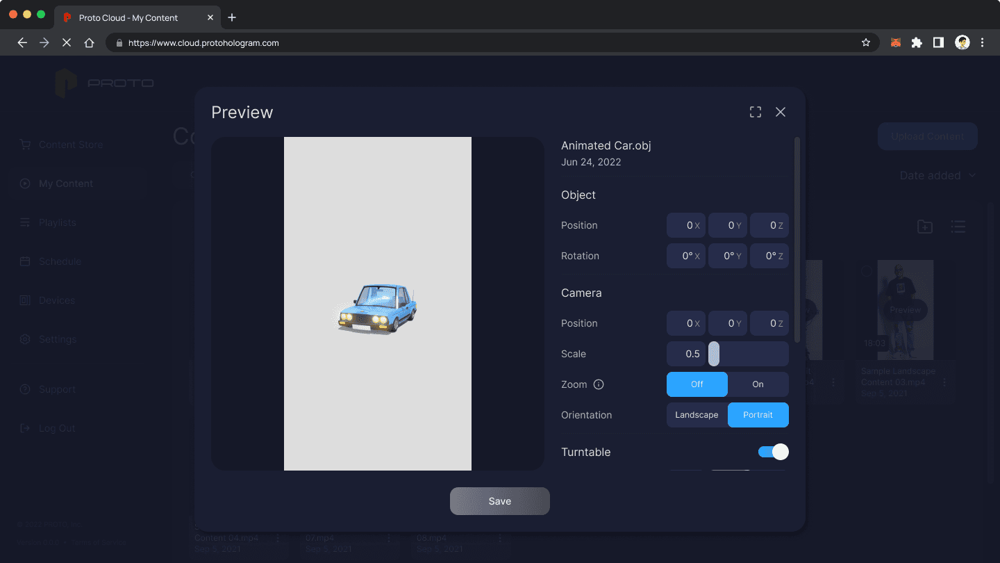
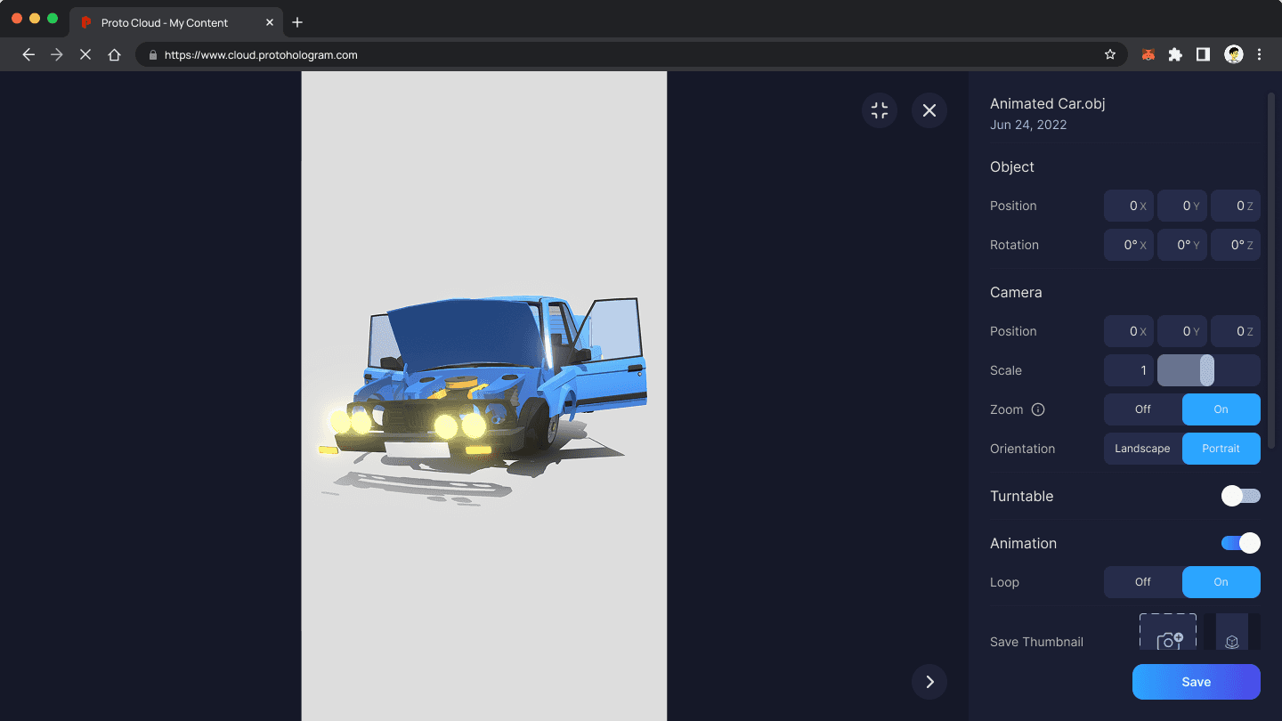
The MVP allowed for the introduction of 3D objects while post-launch, we improved the experience by incorporating key features from tools like Spline 3D and Sketchfab, and tailoring them to fit the Proto Cloud ecosystem.

The Reflection
What I'd do Differently
This project taught me valuable insights into payment UX while also highlighting the relationship between timeline pressure and maintaining research integrity.
1. Push for external user testing before Phase 2
Our personas were informed by Proto's existing consumer base — not direct interviews. We were designing for assumed needs rather than validated ones. Even three sessions with real device owners before Phase 2 launch would have meaningfully de-risked our orbit control decisions.
Establish accessibility as a design constraint upfront
WCAG compliance wasn't a design constraint during this project — it was treated as a post-launch consideration. That's the wrong order. Accessible patterns set a precedent for the team and are far cheaper to build in than retrofit. I now treat WCAG AA as a non-negotiable starting condition.
Document the Phase 1 / Phase 2 boundary more explicitly in handoff
Engineers had questions during Phase 2 implementation that could have been anticipated with earlier cross-functional alignment. A simple 'what's deferred and why' document at Phase 1 handoff would have reduced back-and-forth and given the team a shared reference during Phase 2 scope discussions.
More Projects
Proto Holograms
Unifying the user experience across a growing suite of products through design system contributions, feature development, and cross-functional collaboration.
Year:
2022-23
Industry:
Spacial Technology
Role:
Junior UX Designer
Duration:
6 weeks
The Challenge
At Proto I worked across a diverse range of products that formed their growing ecosystem. Their products included a web-based cloud system, a Live Beam (Stream) App, and a holographic display, each having unique user needs and interaction models.
A Simple Solution with One Limitation
The 3D Objects feature extended across the Proto ecosystem, bridging both web-based CMS and holographic devices (Epic and M). With the goal of enabling users to upload, manage, and interact with the content seamlessly across products.
The one issue, that was unknown to us, was that shipping this feature would launch as a dead end for the majority of users due to them using the legacy Windows OS on their Proto device.
The Research
Identifying an Existing User Experience
With the goal set, I began mapping use cases by identifying the actors, goals, and flows that would define the 3D Objects experience across each platform surface.
From this, I discovered that some use cases, such as the upload processes, mirrored existing functionality. By leveraging established user flows, I ensured that the experience felt familiar to users while addressing varying needs of managing and displaying 3D objects.
Understanding Indirect Competitors
I analyzed four products across two distinct dimensions — chosen deliberately, not by default:
Sketchfab & Spline 3D — for 3D upload and preview UI patterns in a browser context
Spotify & YouTube — for playbar and media control conventions that users already have strong mental models around
Finding 1
3D preview tools universally default to orbit controls (rotate, zoom, reset) — but none addressed the specific constraint of a fixed-distance holographic display. We couldn't copy patterns directly; we had to adapt them for a fundamentally different viewing context.
Finding 1
The remove icon was visible but non-functional. Users tapped it repeatedly with no response — no tooltip, no error, no guidance.
Finding 2
Users approaching 3D content upload consistently attempted to assign content to a device before uploading it — revealing a workflow assumption we'd gotten wrong. Upload had to come first in the information architecture.
Finding 2
Users had no way of knowing they could set a different card as primary. The testing indicated that users relied on independently reasoning this out.
Finding 3
Playbar conventions from video (Spotify/YouTube) translated well as anchors — users expected controls at the bottom of the screen. This gave us a familiar scaffold for an unfamiliar interaction.
Finding 3
Playbar conventions from video (Spotify/YouTube) translated well as anchors — users expected controls at the bottom of the screen. This gave us a familiar scaffold for an unfamiliar interaction.
The Process
As Proto is a startup, it was challenging to pinpoint exact users since limited research was available to define them. Despite this constraint, I created quick personas informed by Proto’s existing consumer base, which helped ground design decisions in realistic user needs and behaviors.
From Insight to Decisions
I explored structural approaches early, hit a hard OS constraint mid-project, then scoped deliberately across two phases to ship a validated foundation before extending the experience.
Early Exploration
The Roadblock
Phase 1: MVP -> Phase 2: Controls
Early Exploration
Two structural approaches tested for the 3D preview experience. Option A (full-screen modal) isolated the preview but removed all context — users felt ‘lost’ navigating back. Option B (inline panel) rendered the preview alongside the content list with no context switch. Internal testing confirmed users expected to stay in place. Inline panel chosen.
The Solution
Decisions that Defined the Shipped Solution
The goal for phase 1 was to introduced this feature for the many users that requested it. Since user were already familiar with our upload, assign, and playback workflow. It was a priority to reuse this experience for the MVP to rollout this new feature.
At launch, Proto received customer support calls to help user update their system to the new ProtoOS. This minor roadblock mid-project allowed for the opportunity to update their device to try out the feature. A happy little accident, if you will.
Post-Launch Decisions
The MVP allowed for the introduction of 3D objects while post-launch, we improved the experience by incorporating key features from tools like Spline 3D and Sketchfab, and tailoring them to fit the Proto Cloud ecosystem.
The Reflection
What I'd do Differently
This project taught me valuable insights into payment UX while also highlighting the relationship between timeline pressure and maintaining research integrity.
1. Push for external user testing before Phase 2
Our personas were informed by Proto's existing consumer base — not direct interviews. We were designing for assumed needs rather than validated ones. Even three sessions with real device owners before Phase 2 launch would have meaningfully de-risked our orbit control decisions.
Establish accessibility as a design constraint upfront
WCAG compliance wasn't a design constraint during this project — it was treated as a post-launch consideration. That's the wrong order. Accessible patterns set a precedent for the team and are far cheaper to build in than retrofit. I now treat WCAG AA as a non-negotiable starting condition.
Document the Phase 1 / Phase 2 boundary more explicitly in handoff
Engineers had questions during Phase 2 implementation that could have been anticipated with earlier cross-functional alignment. A simple 'what's deferred and why' document at Phase 1 handoff would have reduced back-and-forth and given the team a shared reference during Phase 2 scope discussions.
More Projects
Proto Holograms
Unifying the user experience across a growing suite of products through design system contributions, feature development, and cross-functional collaboration.
Year:
2022-23
Industry:
Spacial Technology
Role:
Junior UX Designer
Duration:
6 weeks
The Challenge
At Proto I worked across a diverse range of products that formed their growing ecosystem. Their products included a web-based cloud system, a Live Beam (Stream) App, and a holographic display, each having unique user needs and interaction models.
A Simple Solution with One Limitation
The 3D Objects feature extended across the Proto ecosystem, bridging both web-based CMS and holographic devices (Epic and M). With the goal of enabling users to upload, manage, and interact with the content seamlessly across products.
The one issue, that was unknown to us, was that shipping this feature would launch as a dead end for the majority of users due to them using the legacy Windows OS on their Proto device.
The Research
Identifying an Existing User Experience
With the goal set, I began mapping use cases by identifying the actors, goals, and flows that would define the 3D Objects experience across each platform surface.
From this, I discovered that some use cases, such as the upload processes, mirrored existing functionality. By leveraging established user flows, I ensured that the experience felt familiar to users while addressing varying needs of managing and displaying 3D objects.
Understanding Indirect Competitors
I analyzed four products across two distinct dimensions — chosen deliberately, not by default:
Sketchfab & Spline 3D — for 3D upload and preview UI patterns in a browser context
Spotify & YouTube — for playbar and media control conventions that users already have strong mental models around
Finding 1
3D preview tools universally default to orbit controls (rotate, zoom, reset) — but none addressed the specific constraint of a fixed-distance holographic display. We couldn't copy patterns directly; we had to adapt them for a fundamentally different viewing context.
Finding 1
The remove icon was visible but non-functional. Users tapped it repeatedly with no response — no tooltip, no error, no guidance.
Finding 2
Users approaching 3D content upload consistently attempted to assign content to a device before uploading it — revealing a workflow assumption we'd gotten wrong. Upload had to come first in the information architecture.
Finding 2
Users had no way of knowing they could set a different card as primary. The testing indicated that users relied on independently reasoning this out.
Finding 3
Playbar conventions from video (Spotify/YouTube) translated well as anchors — users expected controls at the bottom of the screen. This gave us a familiar scaffold for an unfamiliar interaction.
Finding 3
Playbar conventions from video (Spotify/YouTube) translated well as anchors — users expected controls at the bottom of the screen. This gave us a familiar scaffold for an unfamiliar interaction.
The Process
As Proto is a startup, it was challenging to pinpoint exact users since limited research was available to define them. Despite this constraint, I created quick personas informed by Proto’s existing consumer base, which helped ground design decisions in realistic user needs and behaviors.
From Insight to Decisions
I explored structural approaches early, hit a hard OS constraint mid-project, then scoped deliberately across two phases to ship a validated foundation before extending the experience.
Early Exploration
The Roadblock
Phase 1: MVP -> Phase 2: Controls
Early Exploration
Two structural approaches tested for the 3D preview experience. Option A (full-screen modal) isolated the preview but removed all context — users felt ‘lost’ navigating back. Option B (inline panel) rendered the preview alongside the content list with no context switch. Internal testing confirmed users expected to stay in place. Inline panel chosen.
The Solution
Decisions that Defined the Shipped Solution
The goal for phase 1 was to introduced this feature for the many users that requested it. Since user were already familiar with our upload, assign, and playback workflow. It was a priority to reuse this experience for the MVP to rollout this new feature.
At launch, Proto received customer support calls to help user update their system to the new ProtoOS. This minor roadblock mid-project allowed for the opportunity to update their device to try out the feature. A happy little accident, if you will.
Post-Launch Decisions
The MVP allowed for the introduction of 3D objects while post-launch, we improved the experience by incorporating key features from tools like Spline 3D and Sketchfab, and tailoring them to fit the Proto Cloud ecosystem.
The Reflection
What I'd do Differently
This project taught me valuable insights into payment UX while also highlighting the relationship between timeline pressure and maintaining research integrity.
1. Push for external user testing before Phase 2
Our personas were informed by Proto's existing consumer base — not direct interviews. We were designing for assumed needs rather than validated ones. Even three sessions with real device owners before Phase 2 launch would have meaningfully de-risked our orbit control decisions.
Establish accessibility as a design constraint upfront
WCAG compliance wasn't a design constraint during this project — it was treated as a post-launch consideration. That's the wrong order. Accessible patterns set a precedent for the team and are far cheaper to build in than retrofit. I now treat WCAG AA as a non-negotiable starting condition.
Document the Phase 1 / Phase 2 boundary more explicitly in handoff
Engineers had questions during Phase 2 implementation that could have been anticipated with earlier cross-functional alignment. A simple 'what's deferred and why' document at Phase 1 handoff would have reduced back-and-forth and given the team a shared reference during Phase 2 scope discussions.