ALKMY Technologies
A mobile-first design for a C2C trading startup, covering the full design process, motion design, and a full rebrand campaign targeting university students.
Year:
2021-22
Industry:
Ecommerce
Role:
Creative & UX Designer
Duration:
4 weeks
The Challenge
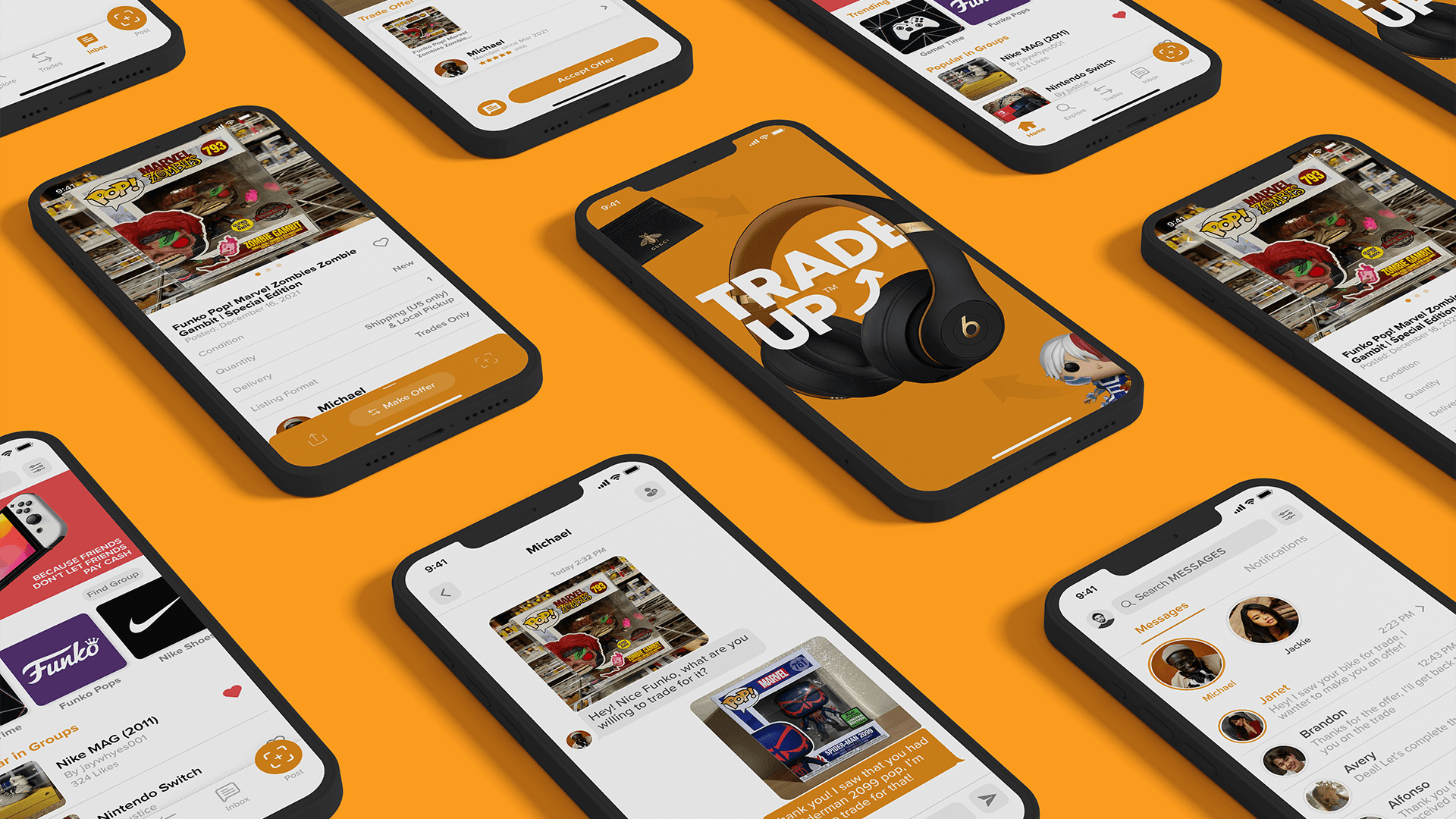
ALKMY is a consumer-to-consumer marketplace for trading, selling, and buying goods. The company was expanding from niche trading communities (school sports, pin collecting) toward a broader young-adult audience of university students, and the existing product was not built for that shift.

The Problem Worth Solving
There were three pain points that stood in the way of growth: the trading flow confused new users, messaging between users was buried, and onboarding offered no personalization for an audience with diverse interests.
The goal went past polishing screens. It was to rework the core experience so it could earn genuine adoption from a new audience.
The Role
What I Contributed
I joined as the Creative Designer alongside two other designers responsible for the rebrand campaign and was then the sole designer responsible for the UX/UI and motion design.
The startup operated without dedicated engineering hand-off tooling, a QA process, a design system, or an information architecture prior to my arrival.
UX Strategy & IA
User Personas
Design Ideation
Brand Redesign
Motion Design
Marketing Assets

The Research
Finding a Signal in a Moving Target
Because ALKMY was live and actively acquiring new users through the rebrand campaign, research was compressed but information-rich.
1
Unmoderated Usability Study
25 university students used the current product and gave honest feedback on possible improvements.
2
User Feedback Survey
The CEO incentivized survey participation early, and responses were sorted into must-fix issues versus roadmap items.
3
Competitive Analysis
OfferUp, Whatnot, eBay, and GOAT were evaluated for UX patterns. OfferUp's personalized onboarding and trust mechanisms exposed clear gaps in ALKMY. Whatnot's and GOAT's youthful visual language validated the rebrand direction. eBay informed the transaction model.
4
Persona Development
Updated personas were created to replace outdated profiles built around the original sports-community audience.

Trading flow lacked intuition
In an unmoderated testing with 25 university students, 16 of 25 participants could not complete a full trade without confusion or backtracking. This made initiating an offer unclear.
Trading flow lacked intuition
The remove icon was visible but non-functional. Users tapped it repeatedly with no response — no tooltip, no error, no guidance.
Messaging was effectively hidden
18 of 25 participants were unable to find where to message a seller without prompting, which blocked the core negotiation behavior the platform depended on.
Messaging was effectively hidden
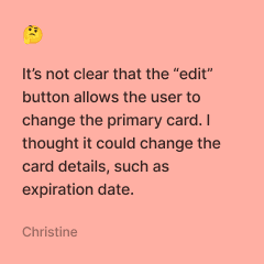
Users had no way of knowing they could set a different card as primary. The testing indicated that users relied on independently reasoning this out.
Content was generic
20 of 25 participants described the initial content feed as not relevant to their interests, and 36% dropped off before completing sign up as a result.
Content was generic
20 of 25 participants described the initial content feed as not relevant to their interests, and 36% dropped off before completing sign up as a result.
The Process



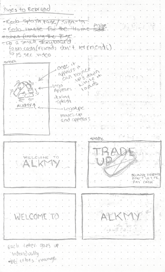
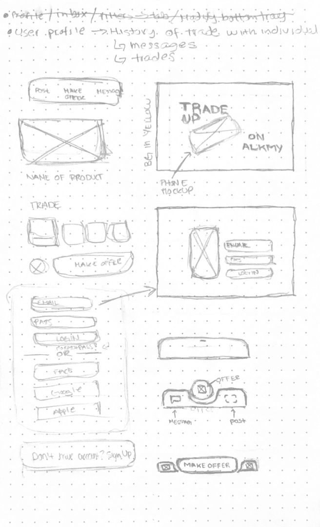
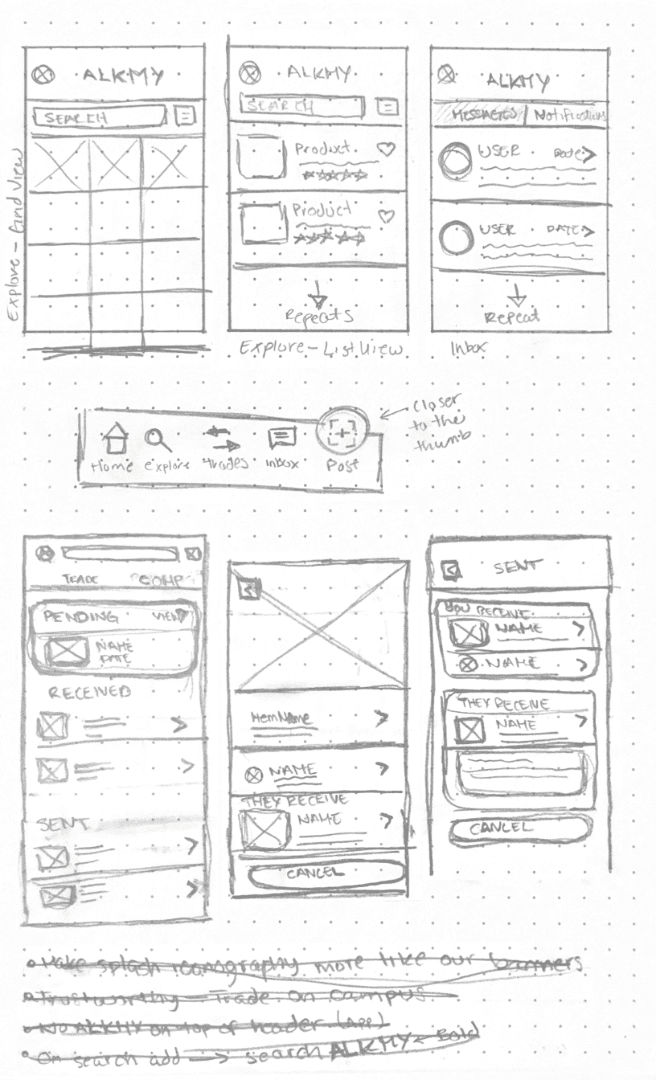
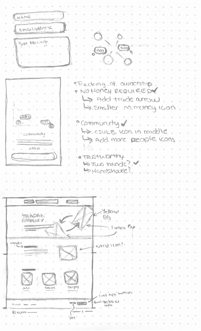
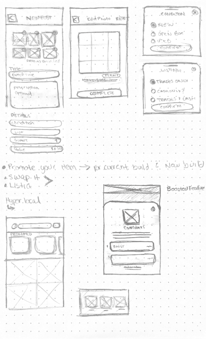
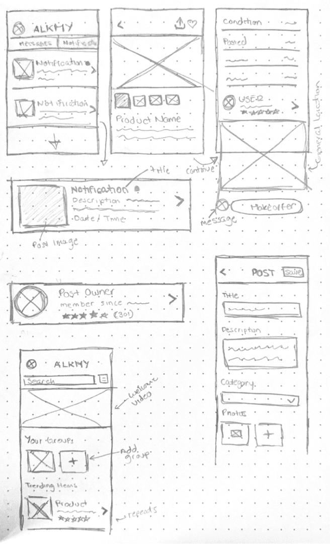

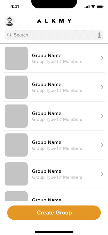


Sketches, Decisions, and Iterations
Architectural Audit
With no existing site map, the first artifact was an architectural audit. I mapped current navigation, flagged orphaned flows, and proposed a restructured hierarchy that pulled messaging and trading toward the surface.
Three Parallel Tracks
From there I worked three parallel tracks (trading, messaging, onboarding), exploring multiple directions for each and presenting alternatives to the CEO for alignment.
Fidelity Ramp
Wireframes moved from sketches to lo-fi in Figma, through mid-fidelity rounds, and into high-fidelity screens built on the new design system.
Sketches, Decisions, and Iterations
Architectural Audit
With no existing site map, the first artifact was an architectural audit. I mapped current navigation, flagged orphaned flows, and proposed a restructured hierarchy that pulled messaging and trading toward the surface.
Three Parallel Tracks
From there I worked three parallel tracks (trading, messaging, onboarding), exploring multiple directions for each and presenting alternatives to the CEO for alignment.
Fidelity Ramp
Wireframes moved from sketches to lo-fi in Figma, through mid-fidelity rounds, and into high-fidelity screens built on the new design system.
Sketches, Decisions, and Iterations
Architectural Audit
With no existing site map, the first artifact was an architectural audit. I mapped current navigation, flagged orphaned flows, and proposed a restructured hierarchy that pulled messaging and trading toward the surface.
Three Parallel Tracks
From there I worked three parallel tracks (trading, messaging, onboarding), exploring multiple directions for each and presenting alternatives to the CEO for alignment.
Fidelity Ramp
Wireframes moved from sketches to lo-fi in Figma, through mid-fidelity rounds, and into high-fidelity screens built on the new design system.
The Solution
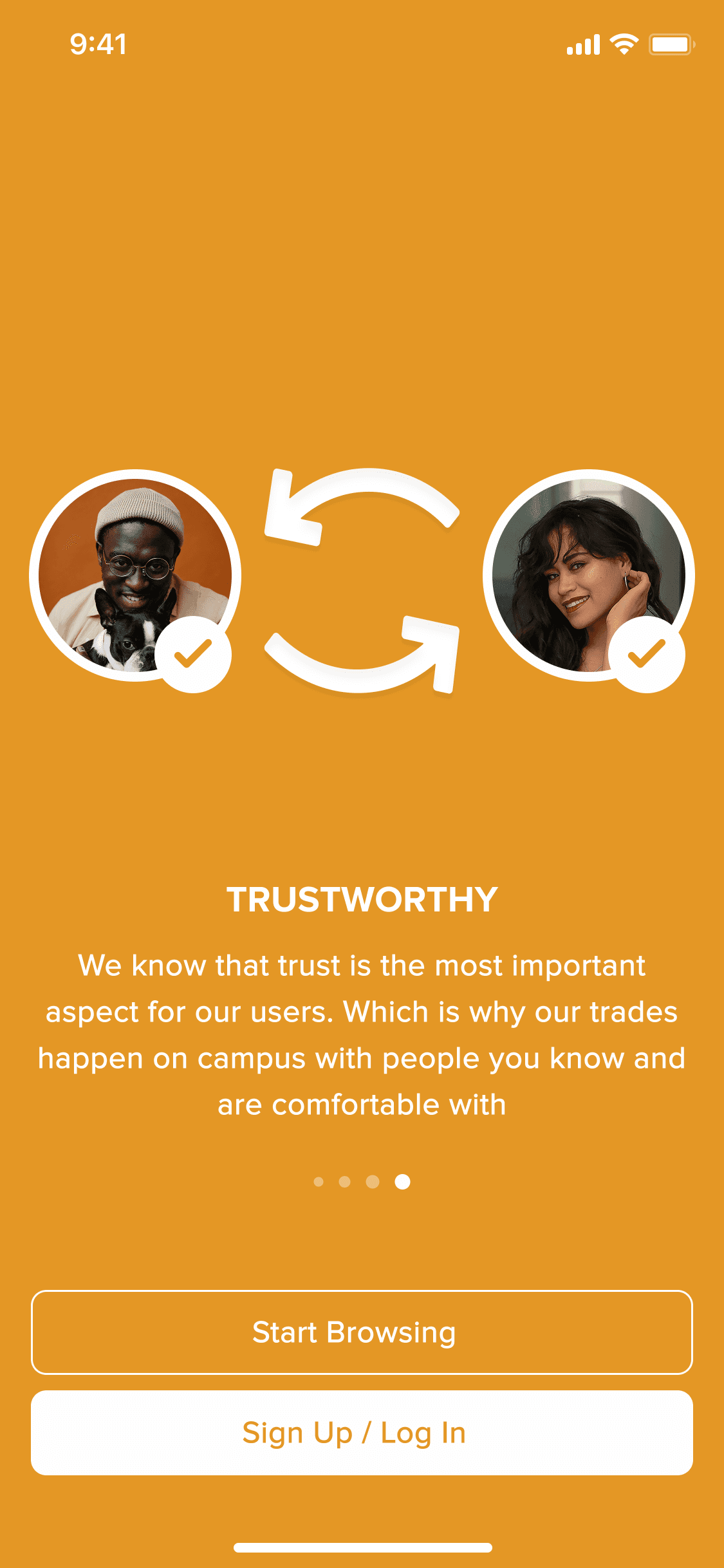
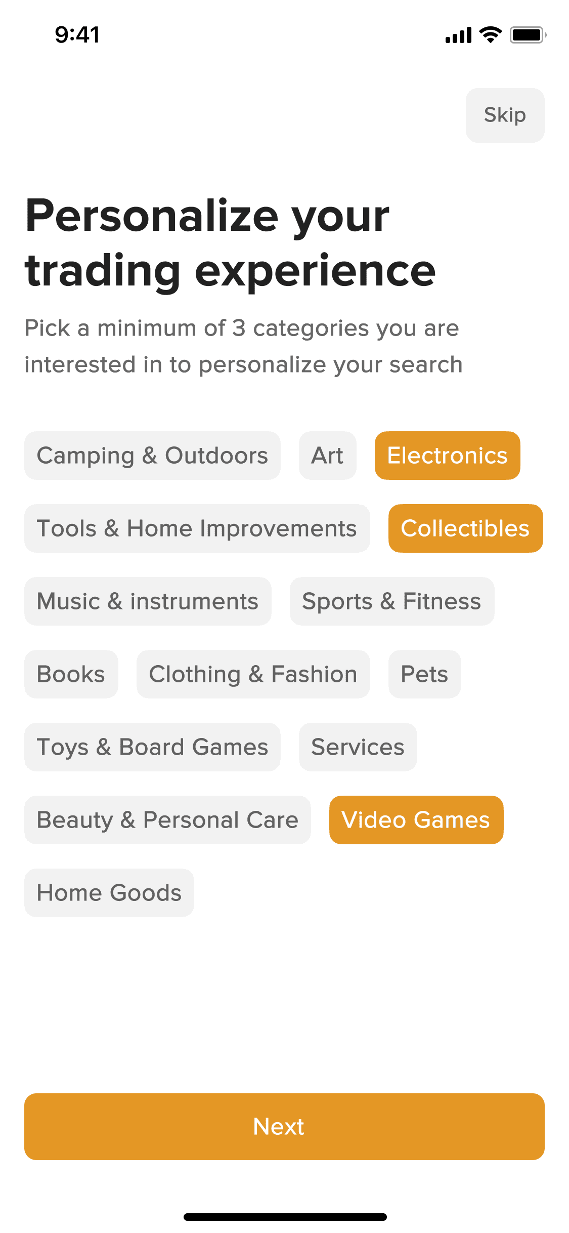
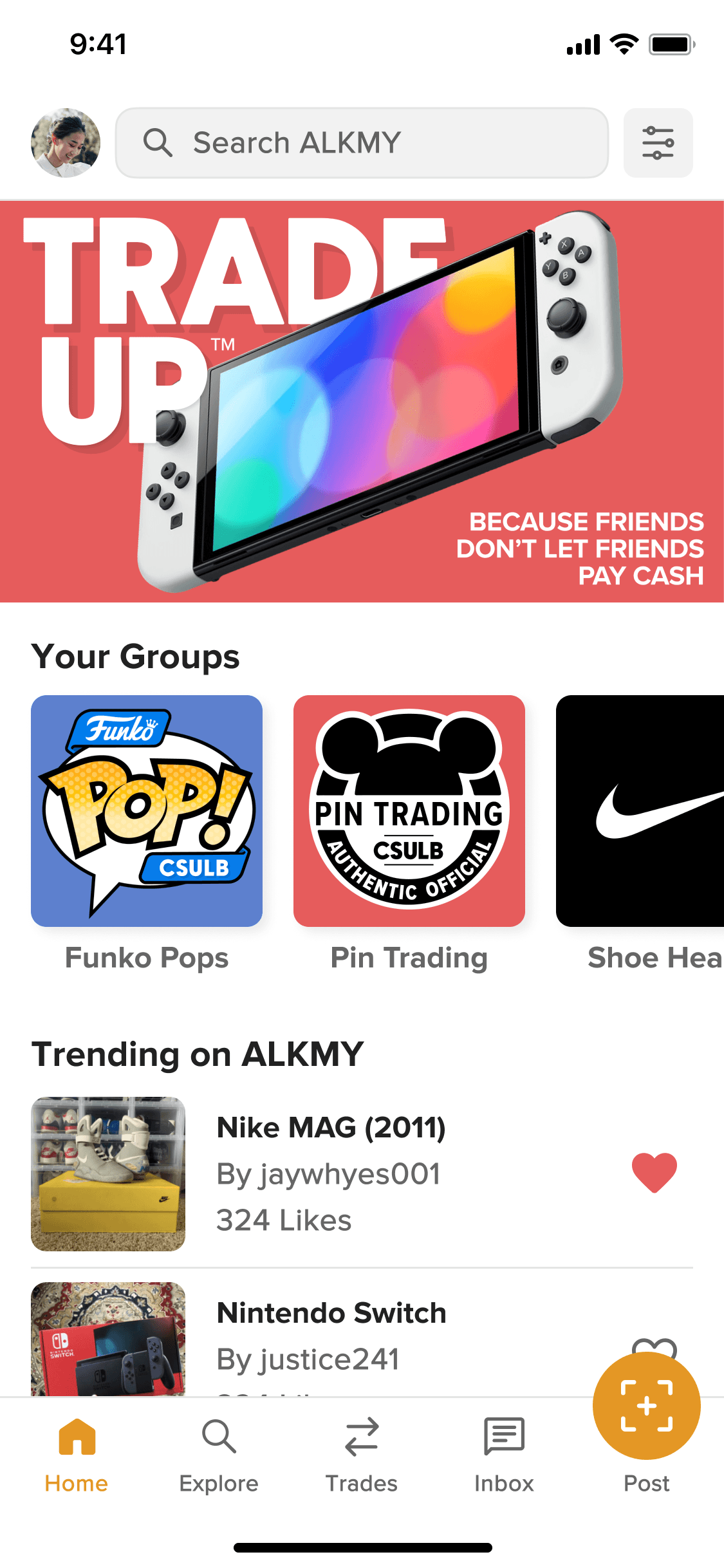
What Shipped and Why It Worked
Redesigned Trading Flow:
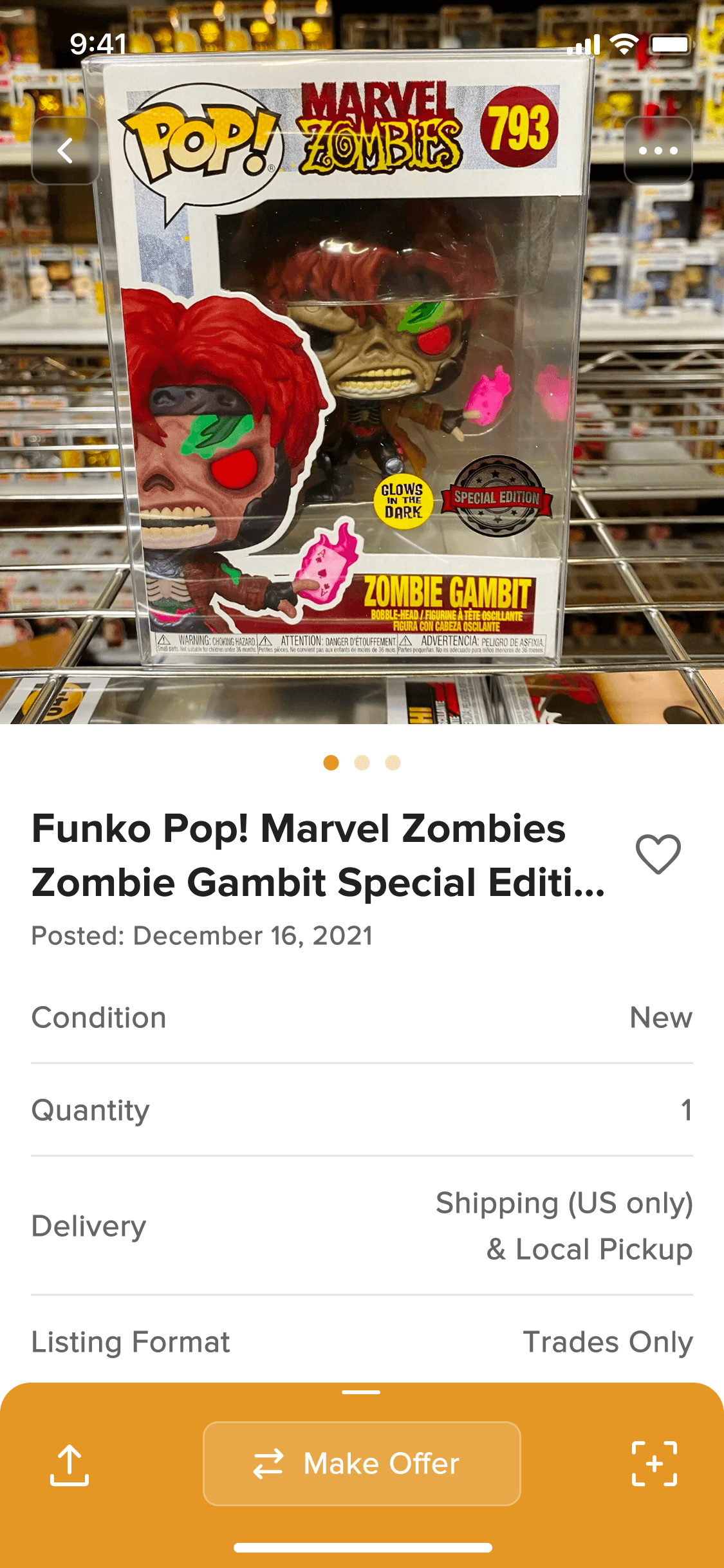
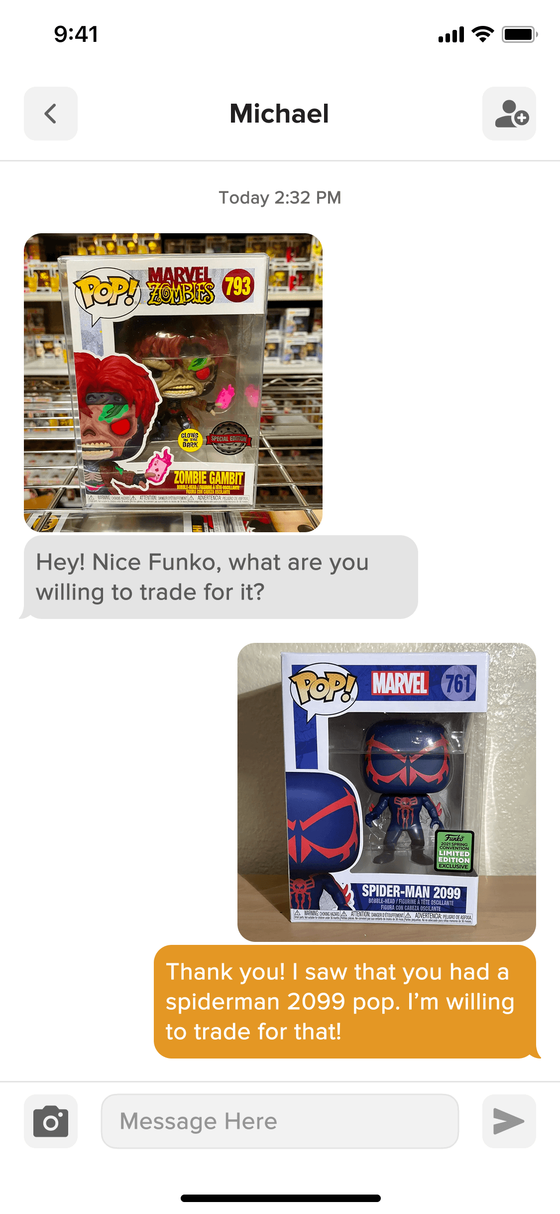
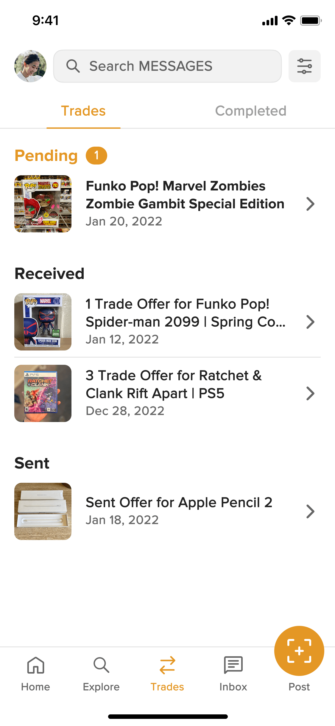
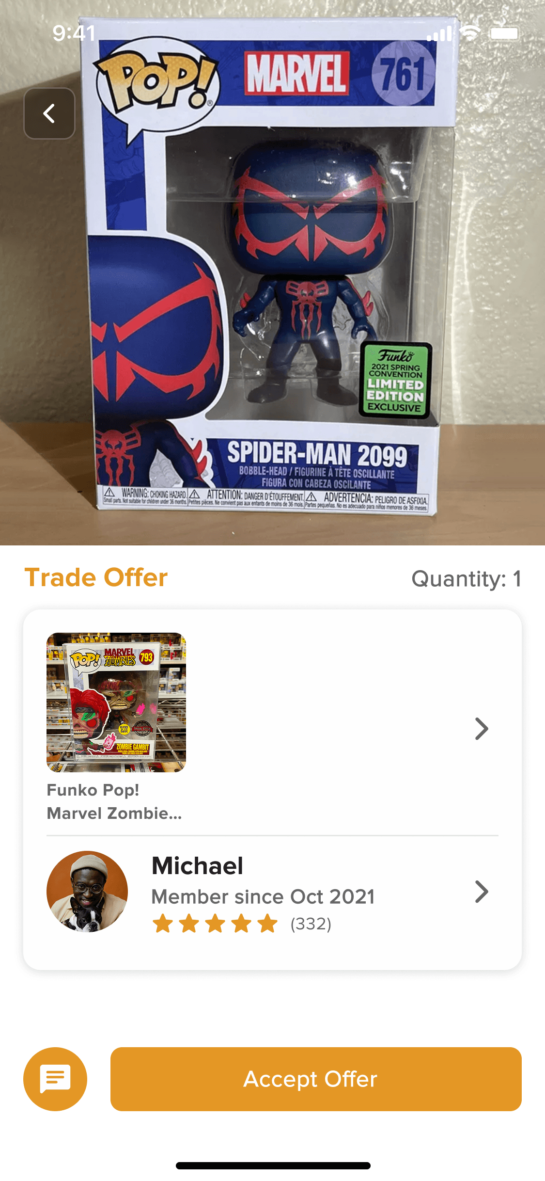
The trading flow was rebuilt from the ground up around a clear offer-initiation pattern: browse listing → express interest → make offer → negotiate via message → confirm trade. Each step was given its own screen with a single primary action, eliminating the decision paralysis users experienced in the original multi-action views.
Surfaced Messaging:
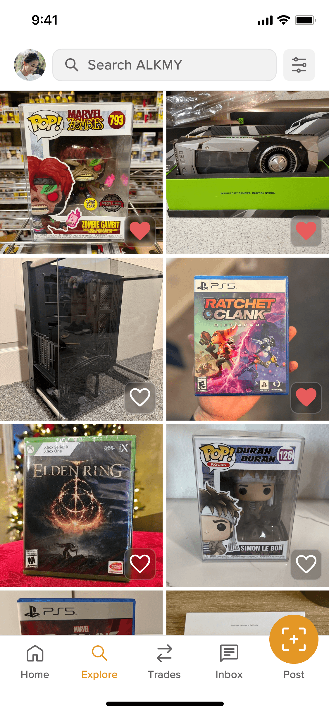
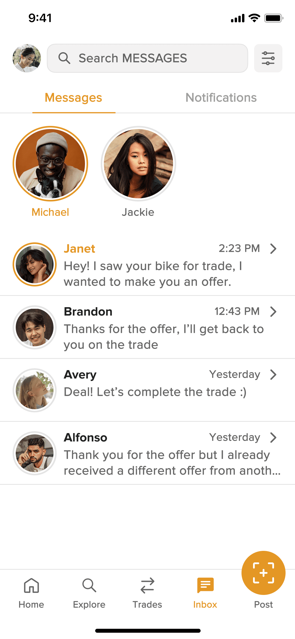
Promoted to a persistent tab in the bottom navigation, plus a contextual “Message Seller” entry point on every listing, so users could start a negotiation without leaving the browsing context.
Personalized Onboarding:
Added an interest-selection step that seeded the home feed with relevant listings from the first session. Each persona mapped to pre-seeded Groups so the app felt lived-in immediately, directly addressing the “nothing here for me” drop-off.
The Impact
What the Work Produced
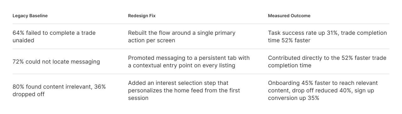
A second unmoderated round with the same 25 participants, run after the redesign shipped, measured the change against the original baselines.
+31%
Trade Task Success
+45%
Onboarding Speed
+35%
Sign-up Conversion
Trading & Messaging
Task success on completing a full trade unaided improved by 31%, and the time to complete a trade dropped by 52%, driven by the single-action-per-screen flow and the contextual messaging entry point that removed the two biggest blockers.
Trading & Messaging
The remove icon was visible but non-functional. Users tapped it repeatedly with no response — no tooltip, no error, no guidance.
Onboarding and Sign-up
Sign-up conversion rose by 35%, while time to reach relevant content improved by 45%. Explore-before-signup removed the forced early commitment, and interest-based seeding removed the “nothing here for me” moment.
Onboarding and Sign-up
Users had no way of knowing they could set a different card as primary. The testing indicated that users relied on independently reasoning this out.
Beyond the numbers
The rebrand drove a measurable surge in downloads that expanded the user base beyond the original sports community, becoming the primary demo in investor presentations, and a design system was established where none had existed.
Beyond the numbers
The rebrand drove a measurable surge in downloads that expanded the user base beyond the original sports community, becoming the primary demo in investor presentations, and a design system was established where none had existed.
The Reflection
What I'd do Differently
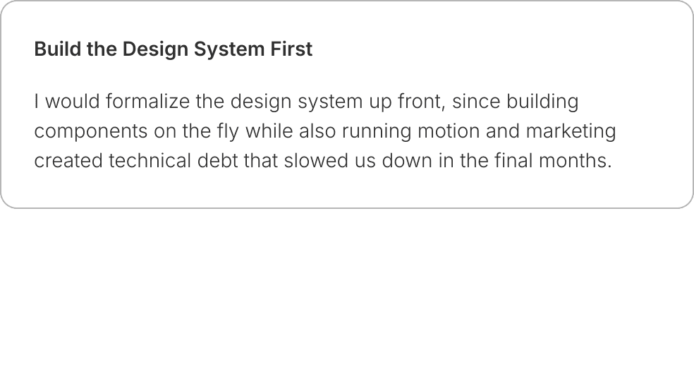
Wearing many hats meant the process took shortcuts I would not accept now.


More Projects

ALKMY Technologies
A mobile-first design for a C2C trading startup, covering the full design process, motion design, and a full rebrand campaign targeting university students.
Year:
2021-22
Industry:
Ecommerce
Role:
Creative & UX Designer
Duration:
4 weeks
The Challenge
ALKMY is a consumer-to-consumer marketplace for trading, selling, and buying goods. The company was expanding from niche trading communities (school sports, pin collecting) toward a broader young-adult audience of university students, and the existing product was not built for that shift.
The Problem Worth Solving
There were three pain points that stood in the way of growth: the trading flow confused new users, messaging between users was buried, and onboarding offered no personalization for an audience with diverse interests.
The goal went past polishing screens. It was to rework the core experience so it could earn genuine adoption from a new audience.
The Role
What I Contributed
I joined as the Creative Designer alongside two other designers responsible for the rebrand campaign and was then the sole designer responsible for the UX/UI and motion design.
The startup operated without dedicated engineering hand-off tooling, a QA process, a design system, or an information architecture prior to my arrival.
UX Strategy & IA
User Personas
Design Ideation
Brand Redesign
Motion Design
Marketing Assets
The Research
Finding a Signal in a Moving Target
Because ALKMY was live and actively acquiring new users through the rebrand campaign, research was compressed but information-rich.
1
Unmoderated Usability Study
25 university students used the current product and gave honest feedback on possible improvements.
2
User Feedback Survey
The CEO incentivized survey participation early, and responses were sorted into must-fix issues versus roadmap items.
3
Competitive Analysis
OfferUp, Whatnot, eBay, and GOAT were evaluated for UX patterns. OfferUp's personalized onboarding and trust mechanisms exposed clear gaps in ALKMY. Whatnot's and GOAT's youthful visual language validated the rebrand direction. eBay informed the transaction model.
4
Persona Development
Updated personas were created to replace outdated profiles built around the original sports-community audience.
Trading flow lacked intuition
In an unmoderated testing with 25 university students, 16 of 25 participants could not complete a full trade without confusion or backtracking. This made initiating an offer unclear.
Trading flow lacked intuition
The remove icon was visible but non-functional. Users tapped it repeatedly with no response — no tooltip, no error, no guidance.
Messaging was effectively hidden
18 of 25 participants were unable to find where to message a seller without prompting, which blocked the core negotiation behavior the platform depended on.
Messaging was effectively hidden
Users had no way of knowing they could set a different card as primary. The testing indicated that users relied on independently reasoning this out.
Content was generic
20 of 25 participants described the initial content feed as not relevant to their interests, and 36% dropped off before completing sign up as a result.
Content was generic
20 of 25 participants described the initial content feed as not relevant to their interests, and 36% dropped off before completing sign up as a result.
The Process
Sketches, Decisions, and Iterations
Architectural Audit
With no existing site map, the first artifact was an architectural audit. I mapped current navigation, flagged orphaned flows, and proposed a restructured hierarchy that pulled messaging and trading toward the surface.
Three Parallel Tracks
From there I worked three parallel tracks (trading, messaging, onboarding), exploring multiple directions for each and presenting alternatives to the CEO for alignment.
Fidelity Ramp
Wireframes moved from sketches to lo-fi in Figma, through mid-fidelity rounds, and into high-fidelity screens built on the new design system.
Sketches, Decisions, and Iterations
Architectural Audit
With no existing site map, the first artifact was an architectural audit. I mapped current navigation, flagged orphaned flows, and proposed a restructured hierarchy that pulled messaging and trading toward the surface.
Three Parallel Tracks
From there I worked three parallel tracks (trading, messaging, onboarding), exploring multiple directions for each and presenting alternatives to the CEO for alignment.
Fidelity Ramp
Wireframes moved from sketches to lo-fi in Figma, through mid-fidelity rounds, and into high-fidelity screens built on the new design system.
Sketches, Decisions, and Iterations
Architectural Audit
With no existing site map, the first artifact was an architectural audit. I mapped current navigation, flagged orphaned flows, and proposed a restructured hierarchy that pulled messaging and trading toward the surface.
Three Parallel Tracks
From there I worked three parallel tracks (trading, messaging, onboarding), exploring multiple directions for each and presenting alternatives to the CEO for alignment.
Fidelity Ramp
Wireframes moved from sketches to lo-fi in Figma, through mid-fidelity rounds, and into high-fidelity screens built on the new design system.
The Solution
What Shipped and Why It Worked
Redesigned Trading Flow:
The trading flow was rebuilt from the ground up around a clear offer-initiation pattern: browse listing → express interest → make offer → negotiate via message → confirm trade. Each step was given its own screen with a single primary action, eliminating the decision paralysis users experienced in the original multi-action views.
Surfaced Messaging:
Promoted to a persistent tab in the bottom navigation, plus a contextual “Message Seller” entry point on every listing, so users could start a negotiation without leaving the browsing context.
Personalized Onboarding:
Added an interest-selection step that seeded the home feed with relevant listings from the first session. Each persona mapped to pre-seeded Groups so the app felt lived-in immediately, directly addressing the “nothing here for me” drop-off.
The Impact
What the Work Produced
A second unmoderated round with the same 25 participants, run after the redesign shipped, measured the change against the original baselines.
+31%
Trade Task Success
+45%
Onboarding Speed
+35%
Sign-up Conversion
Trading & Messaging
Task success on completing a full trade unaided improved by 31%, and the time to complete a trade dropped by 52%, driven by the single-action-per-screen flow and the contextual messaging entry point that removed the two biggest blockers.
Trading & Messaging
The remove icon was visible but non-functional. Users tapped it repeatedly with no response — no tooltip, no error, no guidance.
Onboarding and Sign-up
Sign-up conversion rose by 35%, while time to reach relevant content improved by 45%. Explore-before-signup removed the forced early commitment, and interest-based seeding removed the “nothing here for me” moment.
Onboarding and Sign-up
Users had no way of knowing they could set a different card as primary. The testing indicated that users relied on independently reasoning this out.
Beyond the numbers
The rebrand drove a measurable surge in downloads that expanded the user base beyond the original sports community, becoming the primary demo in investor presentations, and a design system was established where none had existed.
Beyond the numbers
The rebrand drove a measurable surge in downloads that expanded the user base beyond the original sports community, becoming the primary demo in investor presentations, and a design system was established where none had existed.
The Reflection
What I'd do Differently
Wearing many hats meant the process took shortcuts I would not accept now.
More Projects
ALKMY Technologies
A mobile-first design for a C2C trading startup, covering the full design process, motion design, and a full rebrand campaign targeting university students.
Year:
2021-22
Industry:
Ecommerce
Role:
Creative & UX Designer
Duration:
4 weeks
The Challenge
ALKMY is a consumer-to-consumer marketplace for trading, selling, and buying goods. The company was expanding from niche trading communities (school sports, pin collecting) toward a broader young-adult audience of university students, and the existing product was not built for that shift.
The Problem Worth Solving
There were three pain points that stood in the way of growth: the trading flow confused new users, messaging between users was buried, and onboarding offered no personalization for an audience with diverse interests.
The goal went past polishing screens. It was to rework the core experience so it could earn genuine adoption from a new audience.
The Role
What I Contributed
I joined as the Creative Designer alongside two other designers responsible for the rebrand campaign and was then the sole designer responsible for the UX/UI and motion design.
The startup operated without dedicated engineering hand-off tooling, a QA process, a design system, or an information architecture prior to my arrival.
UX Strategy & IA
User Personas
Design Ideation
Brand Redesign
Motion Design
Marketing Assets
The Research
Finding a Signal in a Moving Target
Because ALKMY was live and actively acquiring new users through the rebrand campaign, research was compressed but information-rich.
1
Unmoderated Usability Study
25 university students used the current product and gave honest feedback on possible improvements.
2
User Feedback Survey
The CEO incentivized survey participation early, and responses were sorted into must-fix issues versus roadmap items.
3
Competitive Analysis
OfferUp, Whatnot, eBay, and GOAT were evaluated for UX patterns. OfferUp's personalized onboarding and trust mechanisms exposed clear gaps in ALKMY. Whatnot's and GOAT's youthful visual language validated the rebrand direction. eBay informed the transaction model.
4
Persona Development
Updated personas were created to replace outdated profiles built around the original sports-community audience.
Trading flow lacked intuition
In an unmoderated testing with 25 university students, 16 of 25 participants could not complete a full trade without confusion or backtracking. This made initiating an offer unclear.
Trading flow lacked intuition
The remove icon was visible but non-functional. Users tapped it repeatedly with no response — no tooltip, no error, no guidance.
Messaging was effectively hidden
18 of 25 participants were unable to find where to message a seller without prompting, which blocked the core negotiation behavior the platform depended on.
Messaging was effectively hidden
Users had no way of knowing they could set a different card as primary. The testing indicated that users relied on independently reasoning this out.
Content was generic
20 of 25 participants described the initial content feed as not relevant to their interests, and 36% dropped off before completing sign up as a result.
Content was generic
20 of 25 participants described the initial content feed as not relevant to their interests, and 36% dropped off before completing sign up as a result.
The Process
Sketches, Decisions, and Iterations
Architectural Audit
With no existing site map, the first artifact was an architectural audit. I mapped current navigation, flagged orphaned flows, and proposed a restructured hierarchy that pulled messaging and trading toward the surface.
Three Parallel Tracks
From there I worked three parallel tracks (trading, messaging, onboarding), exploring multiple directions for each and presenting alternatives to the CEO for alignment.
Fidelity Ramp
Wireframes moved from sketches to lo-fi in Figma, through mid-fidelity rounds, and into high-fidelity screens built on the new design system.
Sketches, Decisions, and Iterations
Architectural Audit
With no existing site map, the first artifact was an architectural audit. I mapped current navigation, flagged orphaned flows, and proposed a restructured hierarchy that pulled messaging and trading toward the surface.
Three Parallel Tracks
From there I worked three parallel tracks (trading, messaging, onboarding), exploring multiple directions for each and presenting alternatives to the CEO for alignment.
Fidelity Ramp
Wireframes moved from sketches to lo-fi in Figma, through mid-fidelity rounds, and into high-fidelity screens built on the new design system.
Sketches, Decisions, and Iterations
Architectural Audit
With no existing site map, the first artifact was an architectural audit. I mapped current navigation, flagged orphaned flows, and proposed a restructured hierarchy that pulled messaging and trading toward the surface.
Three Parallel Tracks
From there I worked three parallel tracks (trading, messaging, onboarding), exploring multiple directions for each and presenting alternatives to the CEO for alignment.
Fidelity Ramp
Wireframes moved from sketches to lo-fi in Figma, through mid-fidelity rounds, and into high-fidelity screens built on the new design system.
The Solution
What Shipped and Why It Worked
Redesigned Trading Flow:
The trading flow was rebuilt from the ground up around a clear offer-initiation pattern: browse listing → express interest → make offer → negotiate via message → confirm trade. Each step was given its own screen with a single primary action, eliminating the decision paralysis users experienced in the original multi-action views.
Surfaced Messaging:
Promoted to a persistent tab in the bottom navigation, plus a contextual “Message Seller” entry point on every listing, so users could start a negotiation without leaving the browsing context.
Personalized Onboarding:
Added an interest-selection step that seeded the home feed with relevant listings from the first session. Each persona mapped to pre-seeded Groups so the app felt lived-in immediately, directly addressing the “nothing here for me” drop-off.
The Impact
What the Work Produced
A second unmoderated round with the same 25 participants, run after the redesign shipped, measured the change against the original baselines.
+31%
Trade Task Success
+45%
Onboarding Speed
+35%
Sign-up Conversion
Trading & Messaging
Task success on completing a full trade unaided improved by 31%, and the time to complete a trade dropped by 52%, driven by the single-action-per-screen flow and the contextual messaging entry point that removed the two biggest blockers.
Trading & Messaging
The remove icon was visible but non-functional. Users tapped it repeatedly with no response — no tooltip, no error, no guidance.
Onboarding and Sign-up
Sign-up conversion rose by 35%, while time to reach relevant content improved by 45%. Explore-before-signup removed the forced early commitment, and interest-based seeding removed the “nothing here for me” moment.
Onboarding and Sign-up
Users had no way of knowing they could set a different card as primary. The testing indicated that users relied on independently reasoning this out.
Beyond the numbers
The rebrand drove a measurable surge in downloads that expanded the user base beyond the original sports community, becoming the primary demo in investor presentations, and a design system was established where none had existed.
Beyond the numbers
The rebrand drove a measurable surge in downloads that expanded the user base beyond the original sports community, becoming the primary demo in investor presentations, and a design system was established where none had existed.
The Reflection
What I'd do Differently
Wearing many hats meant the process took shortcuts I would not accept now.